

Emory has created a goal to cut 20% of total emissions by 2020, 36% by 2036, and 50% by 2050. To accomplish Emory’s sustainability initiative, it is necessary to first analyze how Emory currently contributes to their footprint and how to gradually reduce it. One route towards achievement is focusing on the campus’s energy usage and resources.
The impact of energy is recorded in the Greenhouse Gas Emissions file in terms of rates, percentages, and amounts. In the GHG Calculator file, impacts can be inferred from Emory’s Purchased Electricity’s contribution to energy consumption, carbon dioxide emissions, methane release, nitrous oxide input, and other greenhouse gas emission (CO2e). All carbon dioxide, methane, and nitrous oxide emissions are measured in kilograms, providing metric consistency. Energy consumption is measured as one million British Thermal Units and CO2e is recorded in metric tonnes. By analyzing the varying amounts of each emission with the change in energy consumption throughout the years, solutions can be made to reduce electricity usage thus greenhouse gas emissions.
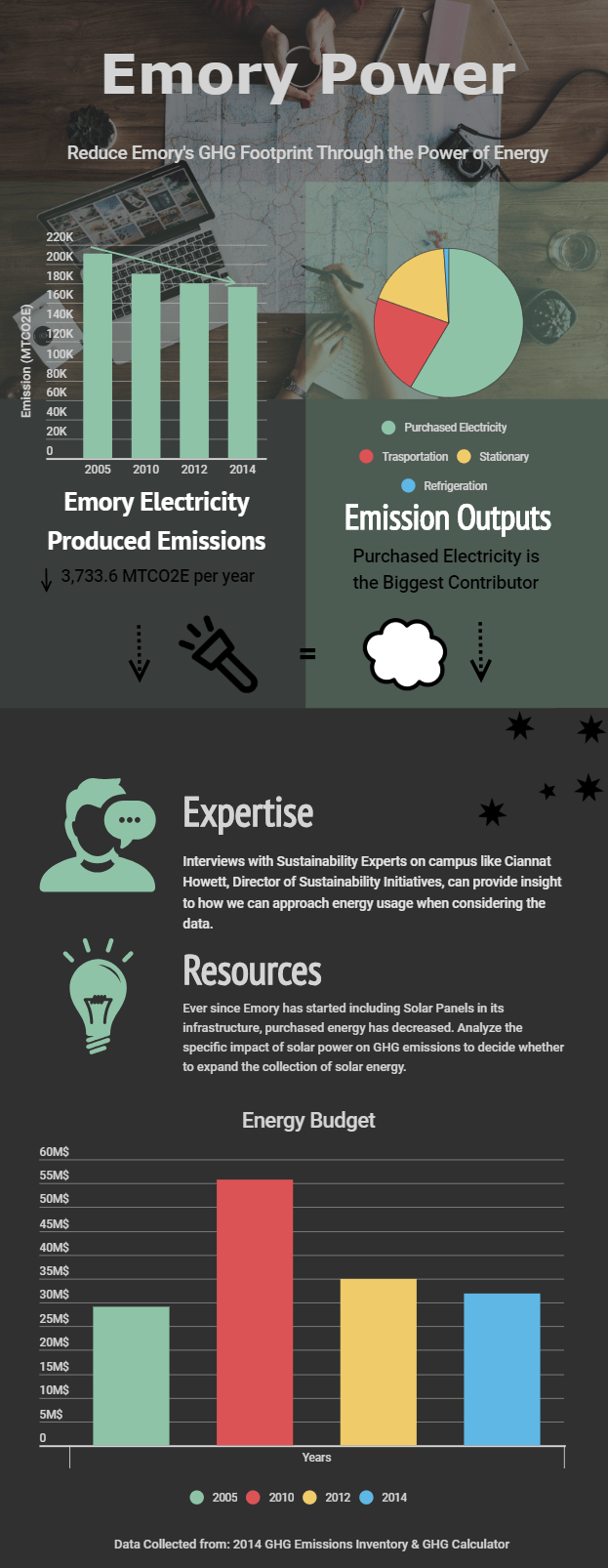
Problem-solving may also arise when considering the GHG Emissions Inventory file. Purchased electricity is the only recording for Scope 2, so this field’s data can provide insight into the yearly trends of input. Scope 2 shows the amount of its overall contribution to Net Emissions in the years of 2005, 2020, 2012, and 2014. The change in Purchased energy can be analyzed to see the direction of energy usage, if there is a decrease then the causes for the downward trend can be discovered to possibly increase the effort put forth that year. Once pinpointing the reason for energy reduction, resources can be used to minimize the challenges posed by Scope 2 to achieve Emory’s goal.
Under the summary of energy, data shows what sources of energy Emory uses. The difference between nonrenewable sources like natural gases versus renewable sources like solar power can be analyzed to create the best solution to maximize energy while reducing our greenhouse gas footprint. Data was also collected for how much money Emory put into its Operating, Energy, and Research budgets. Linking the years to the budget amount to the gas emissions can show a trend to properly plan an environmentally and economically beneficial way to allocate Emory’s resources.
Another pool of data to take account for is the bullet charts. The actual bullet charts compare Emory’s efforts to keep clean with those of other universities. Seeing other schools’ solutions can inspire the practical steps necessary to accomplish the twenty-first century goals. The planned bullet chart is ambiguous on Emory’s efforts, but visualizing what works for other schools can help us with energy conservation thus reduction in total emissions.
